How to Merge Fresh Designs and an Old World Victorian Home
August 24, 2020
Full Bath Renovation: Before and After
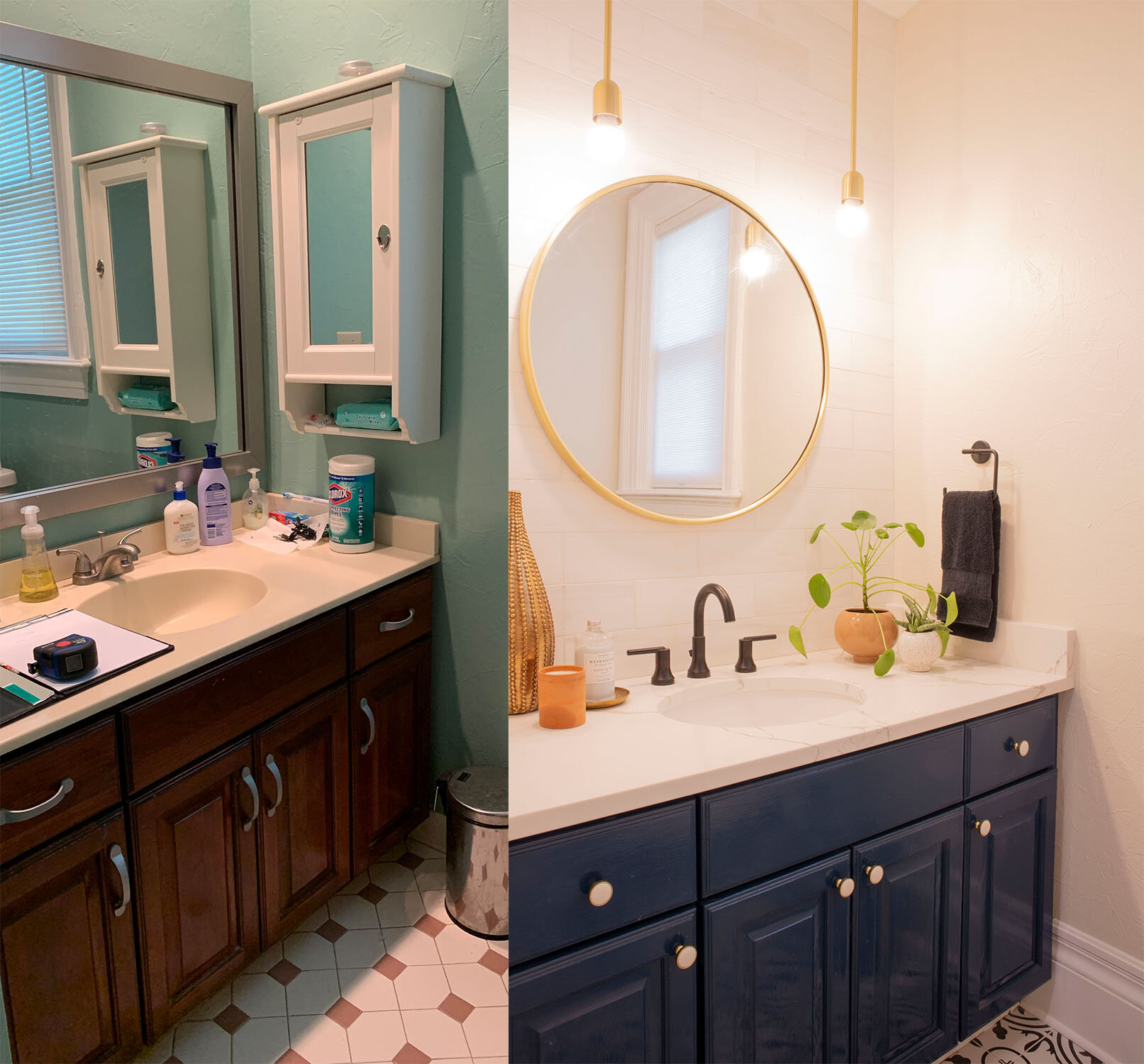
I absolutely love transforming spaces, especially when I’m able to visualize changes that are able to be made relatively quick, easy, and on budget.
This was one of those spaces. Dark, cramped, and outdated, were words I heard from a client when she was describing her bathroom to me. This space was (supposed to be) used by her teenage and tween daughters, but was not because the girls preferred to use the bathroom down the hall which was brighter and more open.
My client came to me after realizing this dilemma, and other than choosing the floor tile and calling her contractor she wasn’t sure how to move forward.
Challenges included a moderate budget and the age of the home. We wanted to modernize the bathroom in a way that would feel fresh and up to date, inline with her daughters’ preferences, yet we wanted to design the bathroom so that it would not clash with the existing beautiful architecture and style of her historic Victorian home. I accomplished this by:
-
Observing the key elements of Victorian era design (e.g. bold colors, elaborate patterns, statement woodwork) and incorporating them throughout the space, while
-
Utilizing modern elements (e.g. lighting and fixtures) with sleek and minimal lines to balance the intricacies of the old world style.
In other words, balance.
As the world turns, style trends come and go, but the architecture of your home remains the same.
It is important to consider the unique structural elements throughout your space when creating a renovation plan so these elements may be highlighted.
It’s possible that you may enhance or add more of these elements into your space(s) so that there is continuity throughout your home.
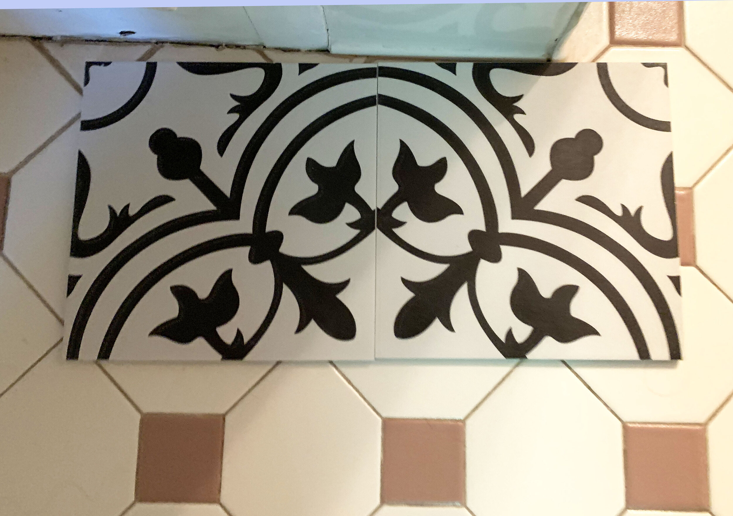
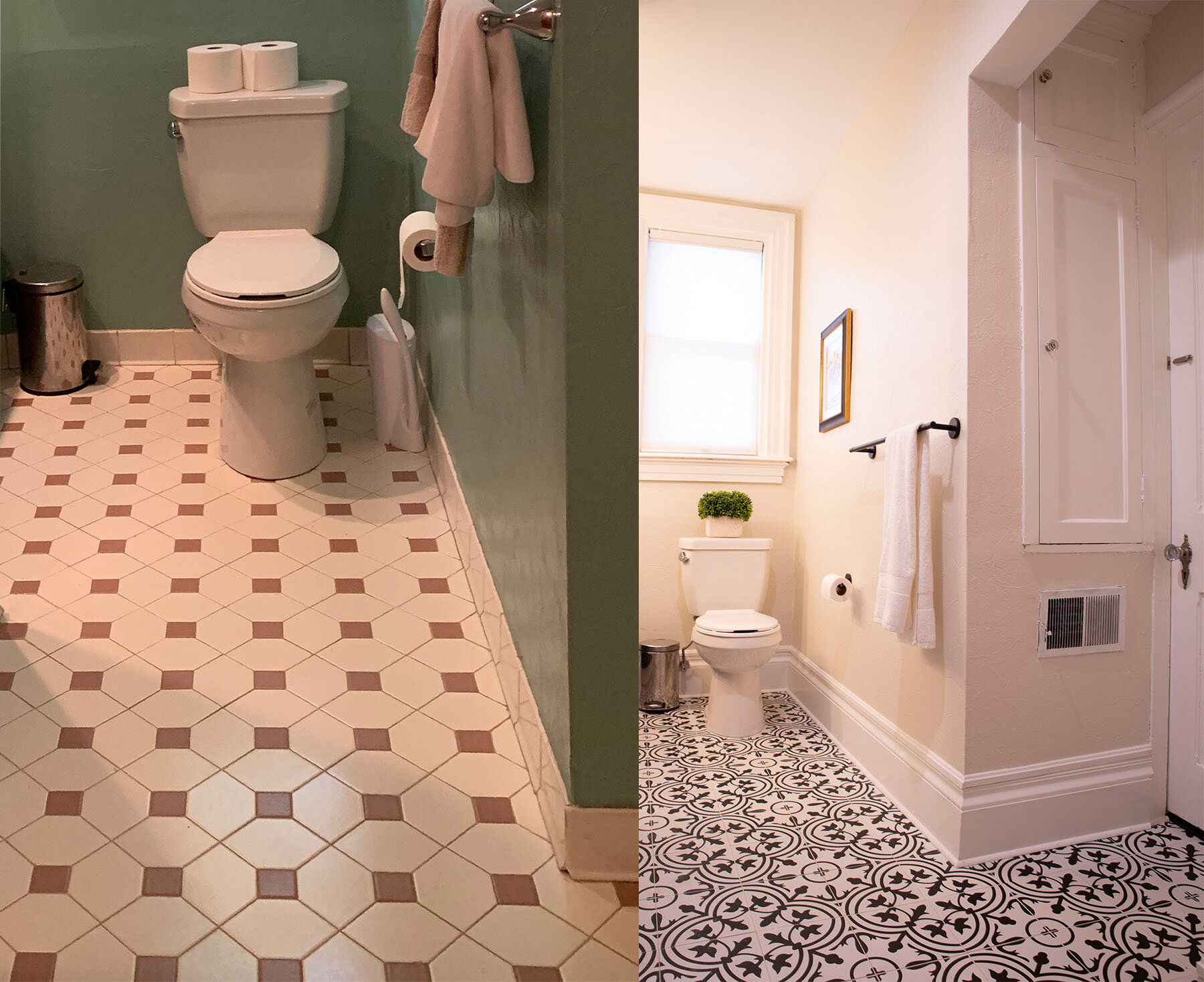
For example, in the Victorian era intricate woodwork was widely used and so was throughout the home. It made sense to carry the beautiful wide baseboard that was in the hallway into the bathroom area. When the space was renovated in the 80’s the trim had been replaced with a tile “baseboard”. It was a no-brainer to incorporate this style back into the space for integrity sake.
Choose Classic Tile Patterns
Further, following key anchor points of this style- more is more! This is why I’m so in love with the tile that was chosen by my client; it is bold and busy. To give the floor patten even more of a boost I added the black and white shower curtain with a pom pom detail. While this supplements the youthfulness and femininity of the space, it also is a nod to the copious amounts of fringe that was used in the late 1800’s.
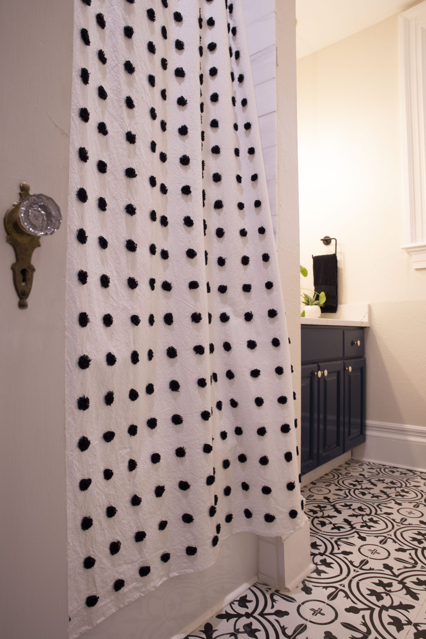
The Bolder the Better
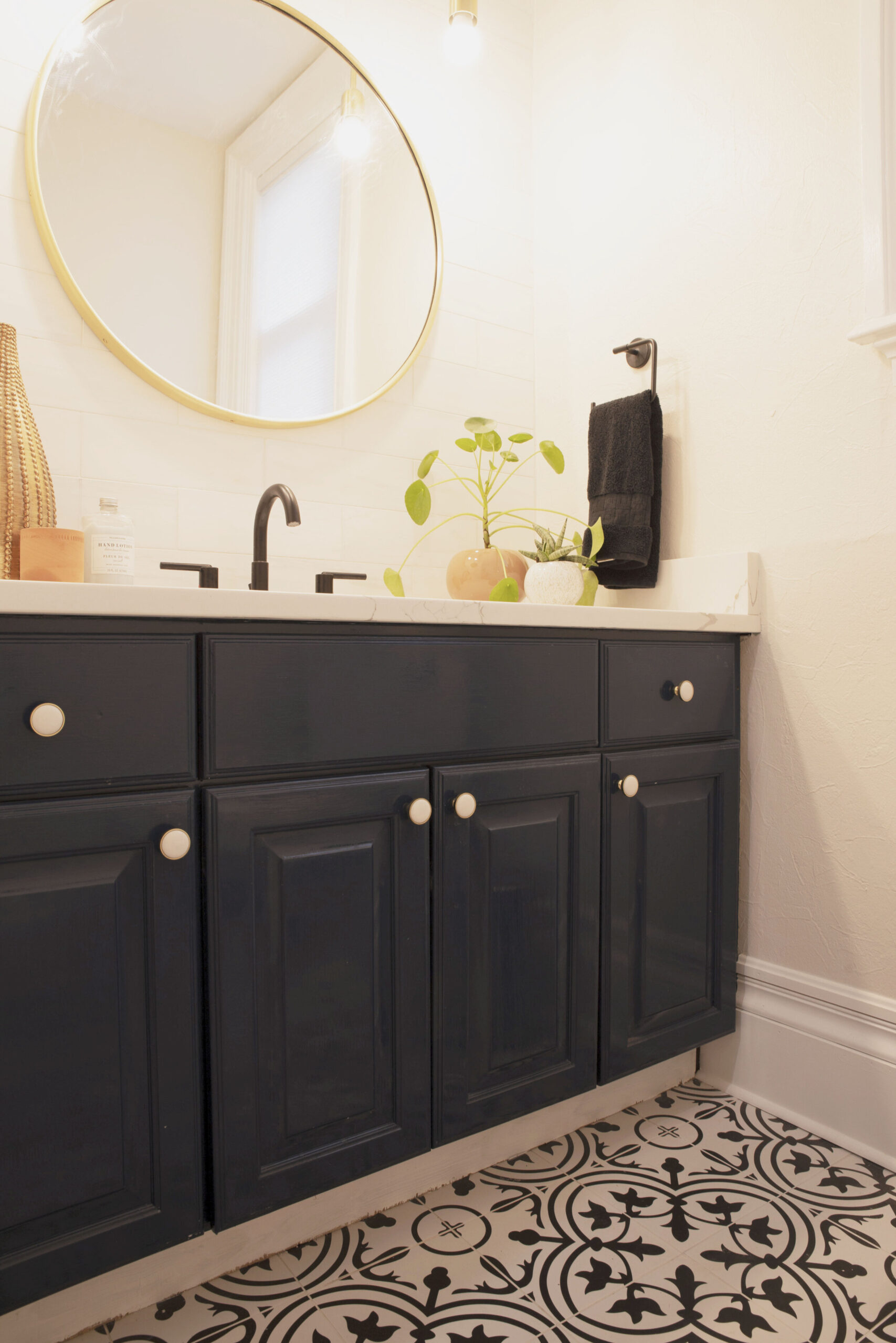
Deep rich colors were popular during the Victorian era, so to incorporate a bold burst of color while being mindful of the budget we refinished the existing vanity and changed out the hardware. The vanity was refinished using a high gloss lacquer with a deep teal tint (Moscow Midnight SW 9142) which breathed life into the otherwise out-of-date piece.
The brass and white resin knobs modernize the vanity while lending contrast to the dark color. Lastly, a remnant of white quartz with a faint line of grey was custom cut to fit the vanity top.
Use Modern Light Fixtures
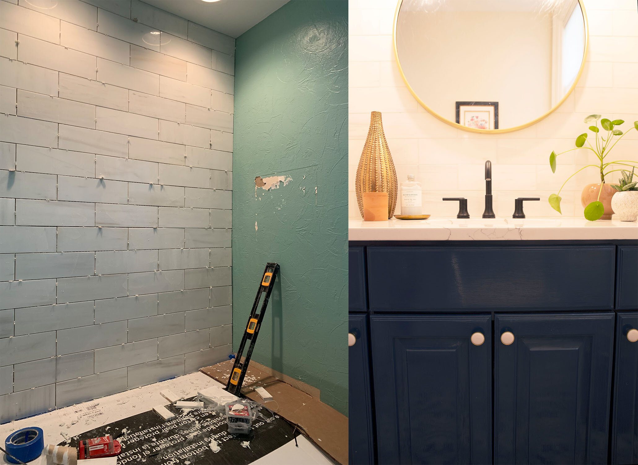
Because there were existing recessed lights above the vanity it was an easy decision to convert these electrical boxes and install mini pendant lights. By doing this it brings the light closer to one’s face - ideal for makeup application - and also provides aesthetic interest by layering the space with the mirror.
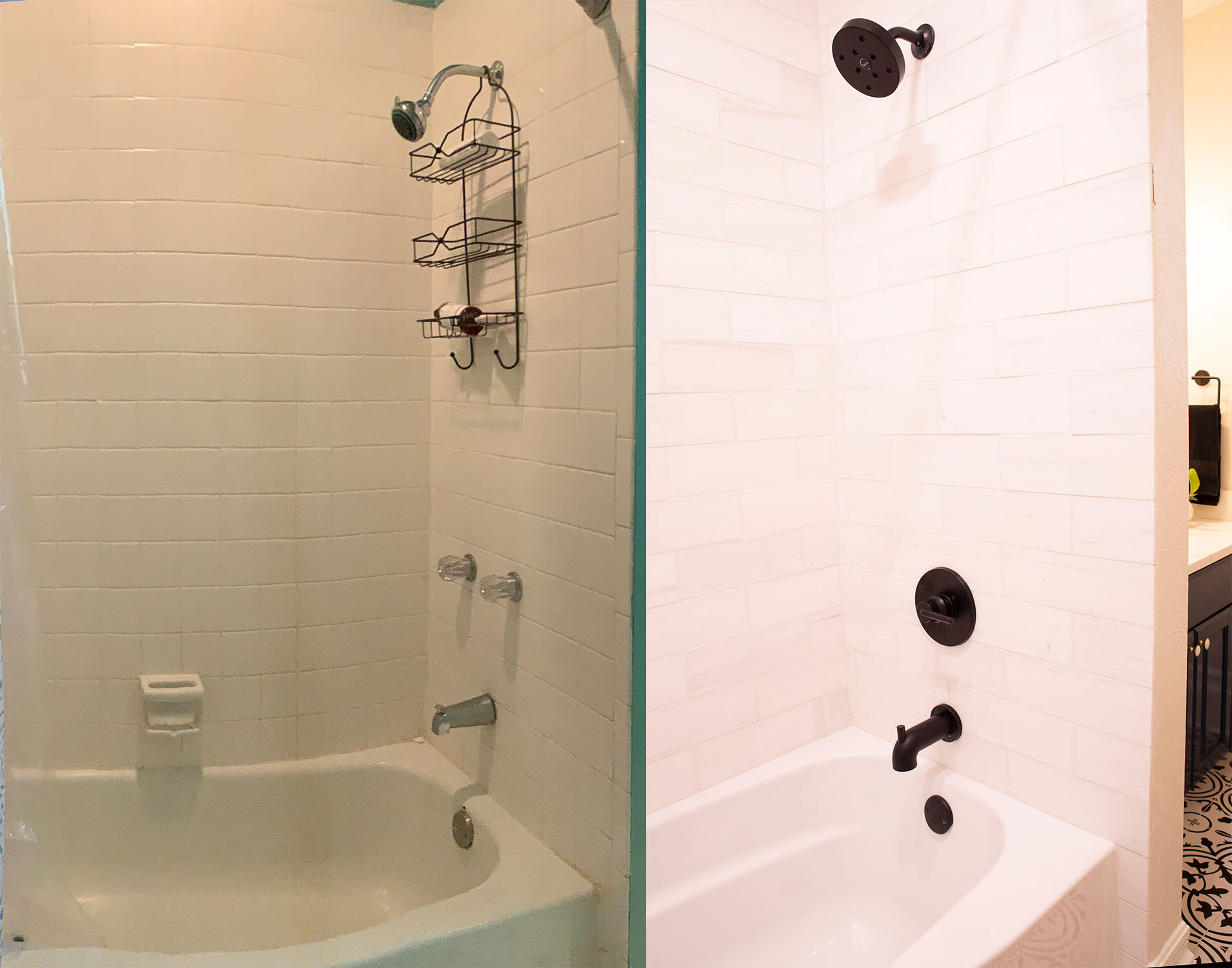
Speaking of layers, I also added the subway tile to be used in the shower behind the vanity mirror for texture. I feel like this vanity area now has as much personality as the teen girls it was designed for.
Incorporate Classic Touches
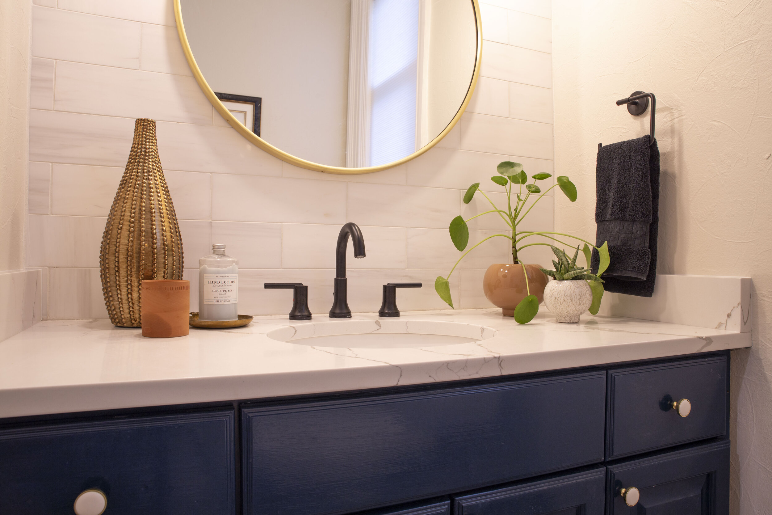
Finally, it is worth mentioning the combination of the matte black and shiny brass metal that was used in the bathroom. As always, incorporating color, texture, and warmth in varying finishes will increase the interest and appeal of any space.
TAKE AWAY
-
Observe, incorporate, and highlight the key elements of your home’s existing design
-
Integrate modern elements for balance
There you have it! A bright, open, and modern bathroom that instead of being avoided, the girls will be happy to use.
Do you have a favorite design element that I incorporated into the space?
If so, please share in the comments below!
Need advice on your next home interior design project?
Welcome Sidebar
FREE Guide
GET STARTED ON THE RIGHT FOOT
Are you fully inspired and ready to take the next step? What are you waiting for? Contact me to get started.