How to Make Your Small Bathroom Seem More Spacious
August 24, 2020
When most people gripe about the bathrooms of their home, the main complaints are the lack of storage space, poor lighting, and ugly tile.
Maybe you hate your bathroom for all three reasons, or maybe just for one. Regardless, most of the time there are very easy and affordable ways to fix all of your problems or any other issue making you want to flush your entire bathroom and start over.
All you need is a good plan.
When it was time to get started on the renovations of this mid-century ranch home, there were a good amount of sections in need of updating. The primary level of the home has two full baths, one of which is part of the master suite. The bathroom we renovated serves the other two bedrooms as well as the friends or family spending time in the home. Needless to say, it’s a space heavily utilized, so it was important to the homeowner to have it finished quickly.
The Before
Color palette
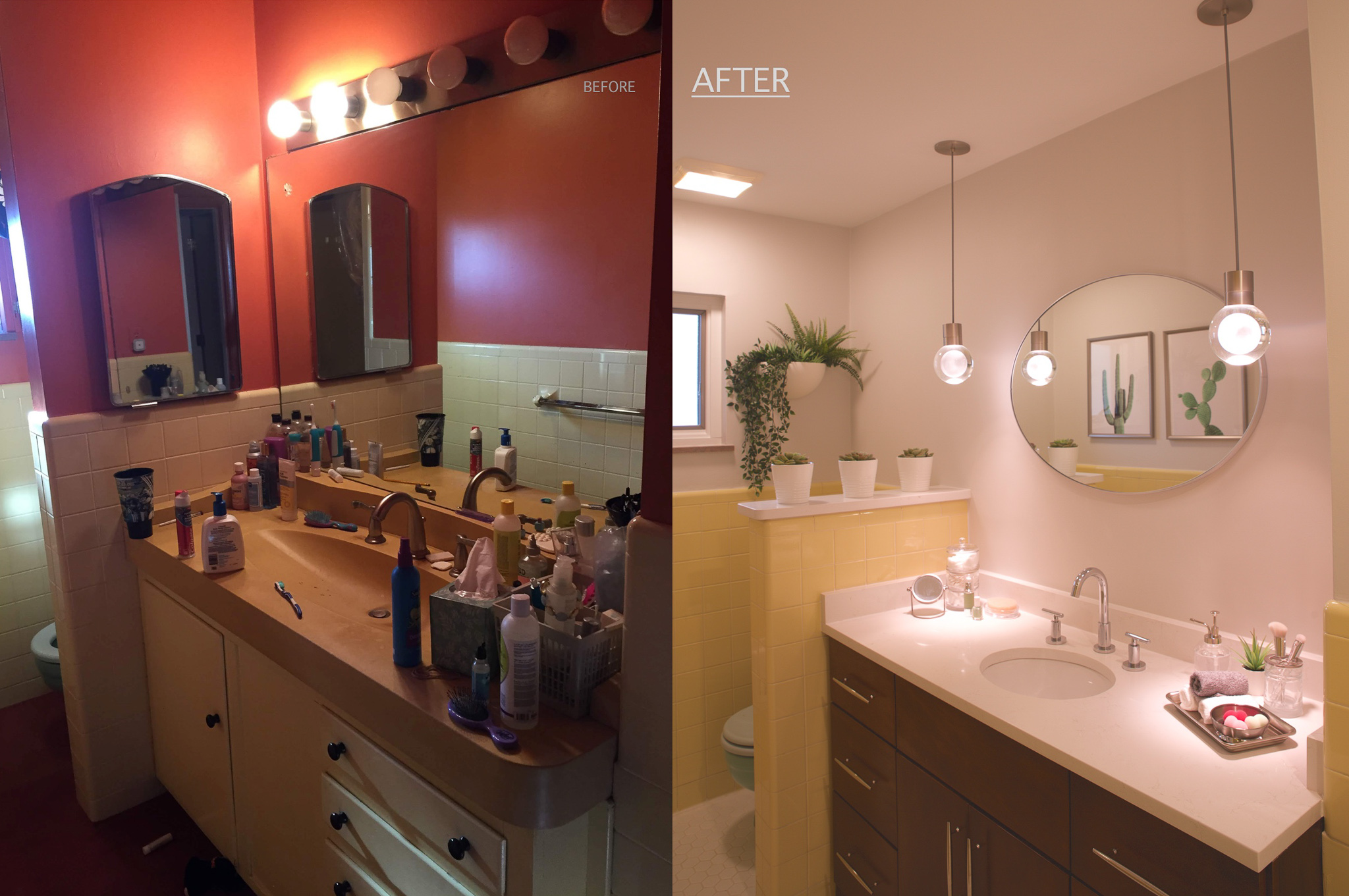
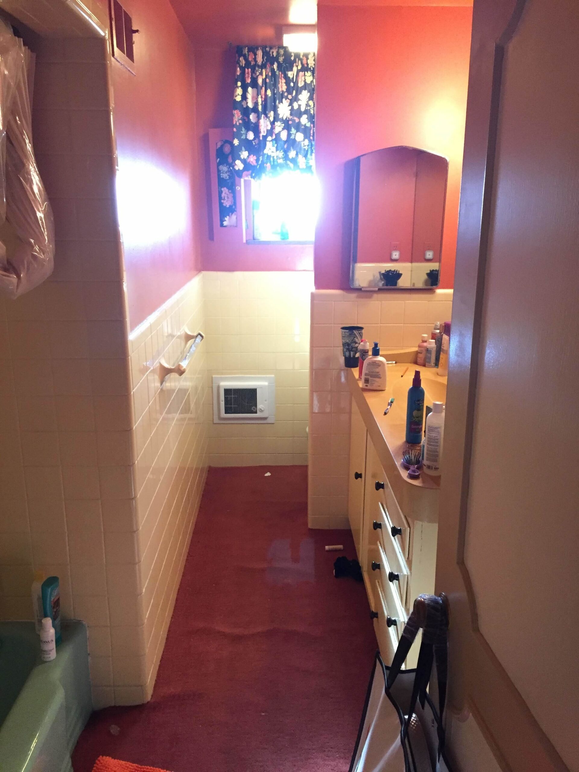
The bathroom had an original aqua-green tub and matching toilet, as well as sunshine-yellow 4×4-inch ceramic tiles. The fixtures, tiles, and grout were all in fairly good shape, so there was no need to replace them. And besides, the aqua-green and yellow color combination was charming, as they are reminiscent of the mid-century era. However, the walls (and ceiling) were painted to match the maroon carpet. Carpet in the bathroom makes most of us squirm, but this carpet was also maroon, making it extra special.
Space constraints
Other roadblocks causing our eyes to cross were the lack of light and the worn-out vanity. There was only one source of natural light — a small window located at the back of the room, which was covered by both shutters and fabric. The vanity base, which was custom built over 50 years ago, had sticky drawers that were odd sizes, unable to hold much and were painted yellow in an attempt to match the tile. The vanity top was concrete — a DIY project by the previous owner — and also tinted yellow.
The Plan
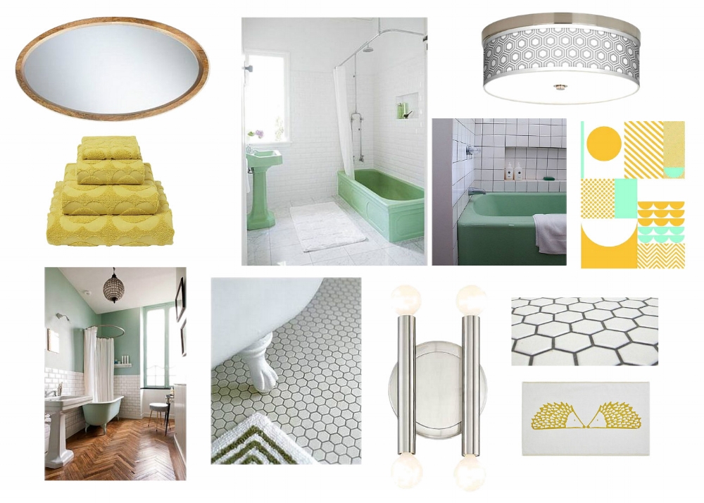
The original Image Strategy for the space included a two-inch hexagonal tile for the floor, fresh paint for the walls, recessed lighting, sconces, and a custom vanity.
Replacing the Tile
The first element, the white hexagon tile for the floor, was quickly selected as we all adored it immediately. We considered continuing the hardwood floor from the hallway into the bathroom, but we didn’t want to replace the carpet with yet another non-traditional flooring option for a bathroom. In the end, tile was the best option to accommodate the amount of water and foot traffic the bathroom would attract.
Because geometric shapes were widely used in original mid-century design (and white was not going to compete with the existing aqua-green and yellow), the white hex was a no-brainer. White tile and grout may sound boring, but we wanted to bring a classic look to the space that would also help lighten it.
I obtained estimates for the yellow wall tile to be replaced with white 4×4, but we decided to keep the cost down and stick with the original since the existing grout and tile finish were perfectly fine.
Thinking of replacing your surfaces with tile? Check out our blog post on choosing tile!
As the saying goes: “They don’t make ‘em like they used to!”
And this was very true in this project. The original yellow tile is much thicker and more durable than most you can buy today. New edge pieces would have been very expensive to purchase, and that’s not including the labor and time required to have it removed.
Removing Obstacles
Now, I’m sure some you think that in order to call a project a true remodel, some drywall needs to go flying! Well, a sledge hammer was used in the removal of the wall separating the toilet from the vanity. This was done to open up the space so the room would appear larger as well as let in as much light as possible through the small existing single window.
The After
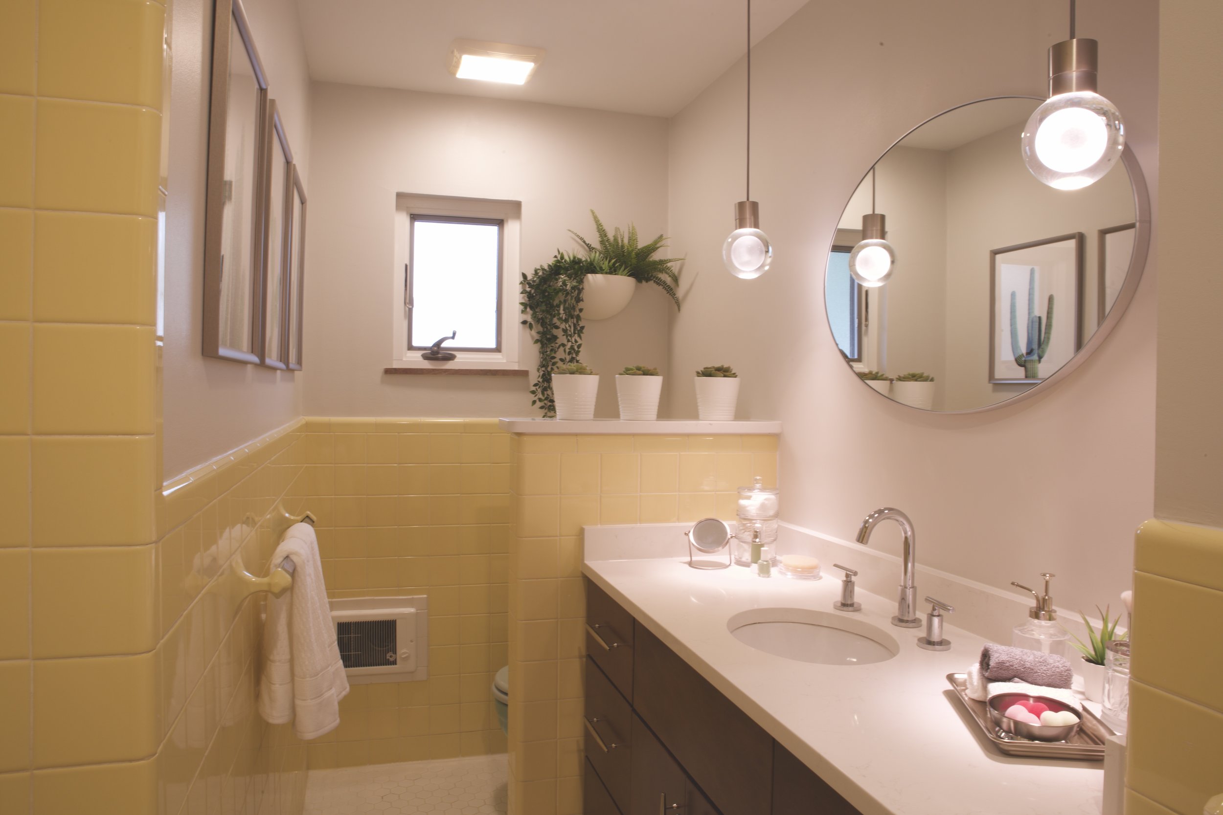
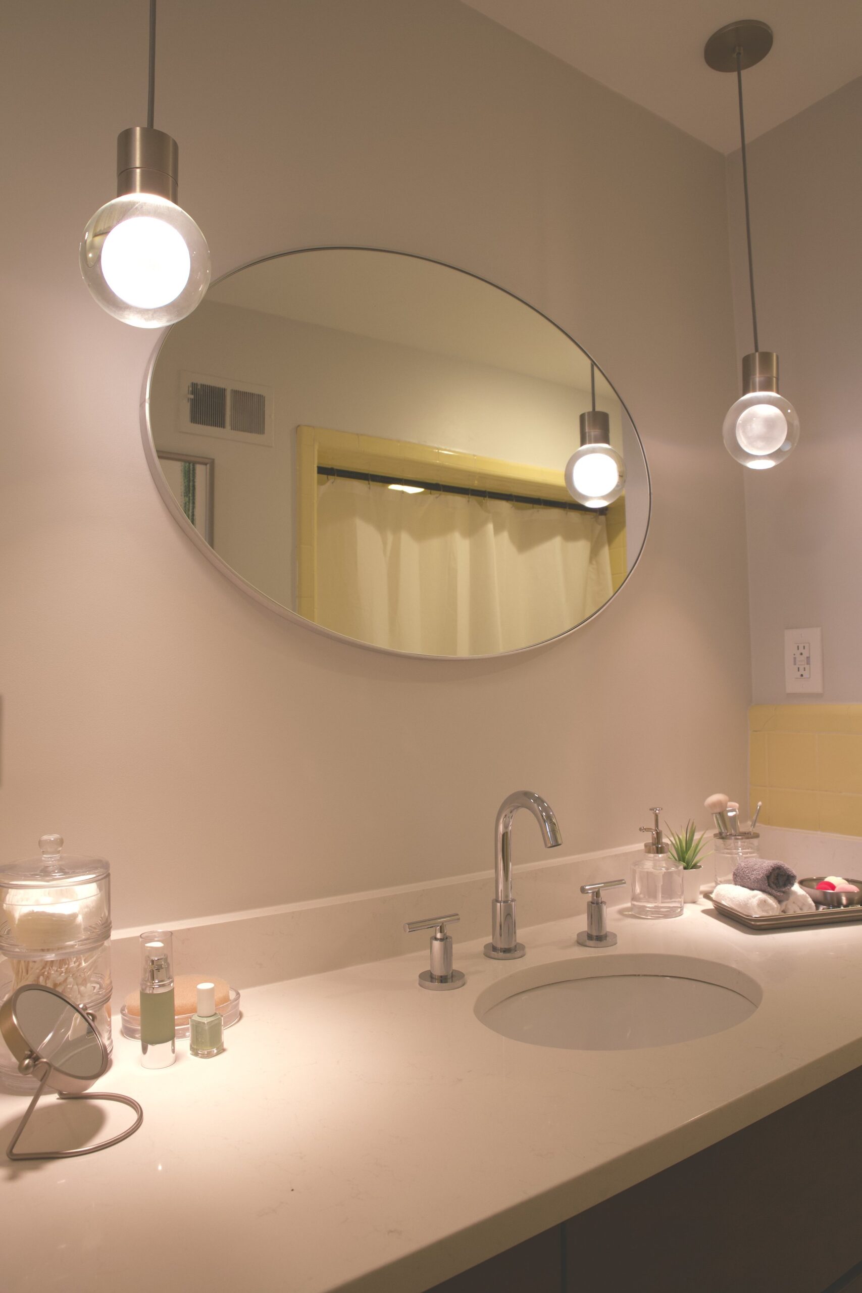
This room, now flooded with light, appears much larger than before.
In my opinion, the most exciting change in the space is the mini pendant lights that flank the mirror like a pair of beautiful, dangly earrings. Originally, we were going to mount wall sconces on either side of the mirror instead, but when these beauties caught our eye we knew we needed to revise the plan.
When the lights are turned on there’s an etched orb that glows inside an outer crystal layer powered by a tiny LED bulb. While the light is soft and diffused, each pendant still puts out 290 lumens. These pendants were a bit pricey, so if the budget went south, they’d be the first thing to go. (Luckily, there were no major surprises for this project).
These light fixtures are the show pieces of the space and were worth every penny. In addition to the pendant lights, three recessed can lights and a new lighted exhaust fan were installed.
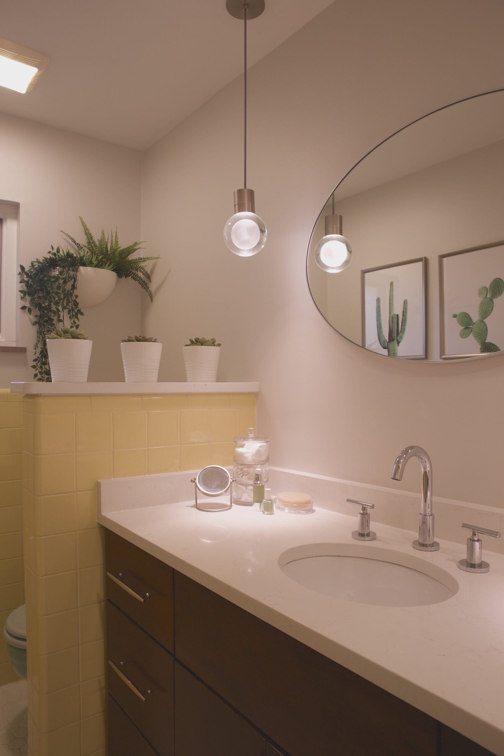
Below the pendants is a new custom vanity with plenty of soft-close drawers and cabinets, stained a walnut color to bring some warmth to the space. The vanity top is now white quartz with a subtle silver vein and a recessed oval bowl sink. This new piece was outfitted with chrome hardware, which coordinates with the faucet.
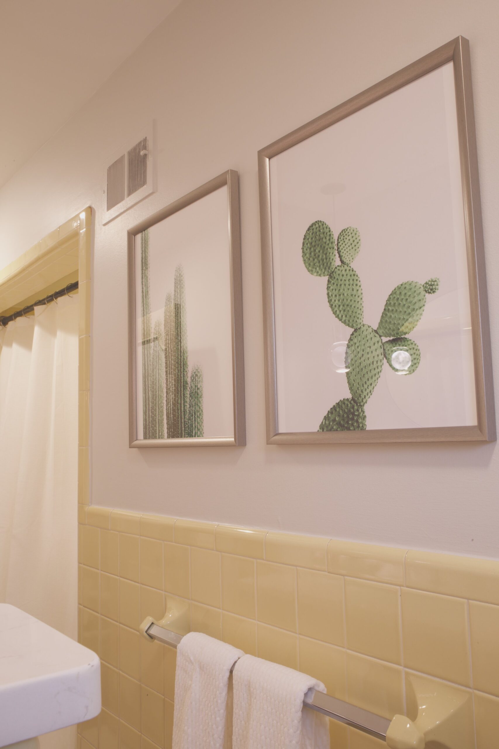
The space was staged with pops of aqua-green, using potted succulents and wall art of cacti, a nod to the Arizona deserts that were once the couple’s old stomping grounds. The walls were painted with First Star (Sherwin Williams 7646), a barely-there gray that lightened the space without making it too stark.
Finally, the absence of wall between the toilet and the vanity now allows you to see the entirety of the space as you walk in while still offering privacy when more than one person tries to use the room. The half-wall was capped with matching white quartz — same as the vanity top.
The Takeaway
-
If there are fixtures in your space that are functional yet unappealing to the eye, try to embrace them. Be sure to keep anything you add to the space white, black or another neutral color. If your main fixtures are are already neutral, don’t be afraid to add a few pops of color with items that can easily be replaced; for example, bath towels, art pieces, rugs, or even wallpaper. Ultimately, it is your space so it should reflect your taste.
-
Cramped spaces will appear even more cramped if they’re poorly lit. A few recessed lights in the ceiling can make a world of difference and are relatively budget-friendly. If funds allow, adding interesting sconces can make a big impact, too. Check out our blogs on how to tackle your budget and timeline for your next project!
-
Always be sure to use lights that put out a brightness level (lumens) that is appropriate for your space. Finally, take advantage of any and all storage within your vanity or other cabinetry/closets; using bins or drawer dividers will keep your space more organized and seem more spacious.
Of course, we were unable to physically make this small space larger than it is, but it now appears to be much larger with a new coat of paint, new tile floors, improved lighting, and wider sight lines.
What do you think?
We’d love to hear your thoughts or questions about how we tacked this project. Complete our quick Inquiry Form to get started!
