How to Mix Colors, Patterns, and Textures in Home Interior Design
October 29, 2021
When you’re searching for the home inspiration that you could mimic in your own home, you might encounter a common roadblock: There are thousands of colors, patterns and textures to choose from. At Jackie Barnes Design, we don’t like to gate-keep advice on processes like this, because everyone deserves a home that uses interior design to serve their mental health!
There is an endless number of colors, patterns and textures to choose from, and maybe you don’t want a plain white, minimalist space with clear cut lines and a personality that isn’t you.
You want your space to be as unique as you. We get it.
I’ll let you in on some interior designer-grade secrets for making your space look cohesive even when using elements you might not think go together at all.
Start With the Basics
Like most things in life, it’s often beneficial to start at the beginning.
Before deep diving into what textures compliment what patterns, simply start with your color choice. This is an important part of the puzzle as your color choice will inform the rest of your choices throughout this process.
Additionally, your color choice will serve as the key element that will drive the story of your space. Living rooms are great examples of this:
Think about your living room. What story do you want it to tell? In other words, how do you want your living room to make you feel? Maybe you want a moody end-of-day relaxation space to wind down from work. Or maybe you want it to be light and airy to promote productivity because you work from home.
The way you want a space to make you feel will guide you in choosing colors that suit your goal best. I suggest doing some research on different colors and the power they hold over our mental health and productivity.
Color is just one layer to creating a cohesive space, but it’s a great place to start!
Pro Tip:
The more color you add to a space, the more energy you will inject. For example, if you want a calm room, stick to one basic color and vary this one color in differing shades. If you want a room that will bring you excitement, choose a color palette with three to five different yet complementary hues.
In With the Old and In With the New
This is the fun part! When selecting patterns and textures, you’ll notice that some feel modern while others feel vintage or antique.
Never tell yourself you have to lean one way or the other. In fact, mixing the two - old and new - is a great way to keep a space fresh yet classic. For example, polka dots and plaid may feel like mortal enemies, but they can actually look really great together. It’s one of those things that shouldn’t work but just do!
There’s no harm in trying something and deciding that it’s not for you, in the end. If you’re feeling a little less daring than a marriage of polka dots and plaid, you can incorporate modern and vintage through textures.
Before we move on, let me make something clear: When we talk about textures, we are not just talking about fabric. We are talking about metals, tiles, woods, and pretty much anything else with a clearly defined texture.
For the most part, everything you bring to this project will more or less be new to you. You might find a piece that appears old, but you’ll actually be the first to own it. This is perfectly fine! You don’t have to thrift every “old” piece you find in order to achieve an antique look.
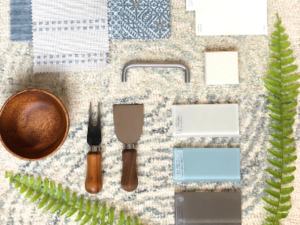
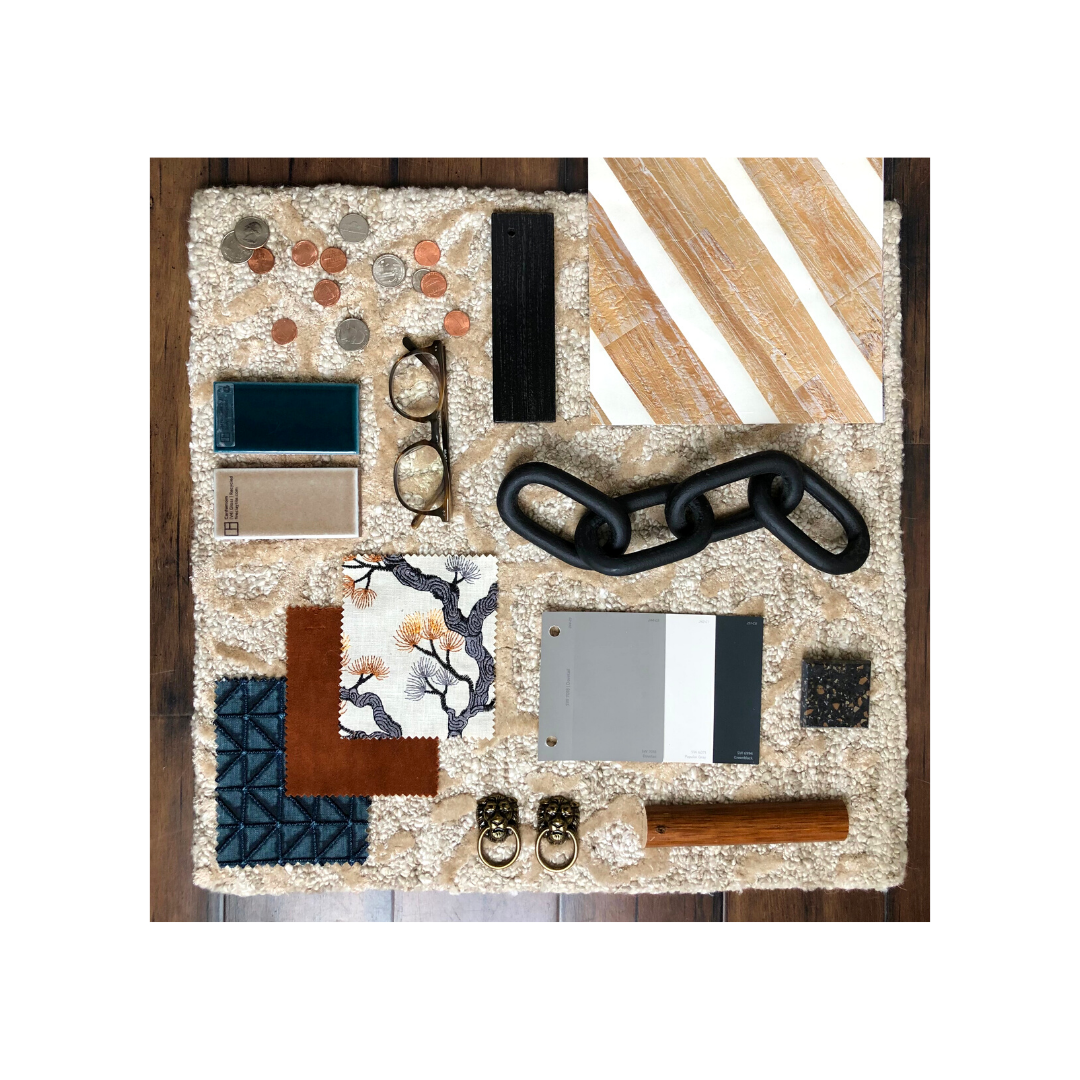
Take this mood board on the right, for instance:
Notice the mixing of textures here. We have a sense of newness in the wood, paint and tile. But the metals provide an element of age, even though they are actually freshly manufactured.
Pro Tip:
When combining traditional and modern elements, pay attention to balance. When adding a modern piece, incorporate one antique piece to keep the scale harmonized. By doing this, you will create a well-curated room, one that represents your style rather than a matchy-matchy showroom.
Mix, But Never Forget to Match
Where are my visual learners at? This section’s for you.
I’m going to pull together some mood boards, including the one from the previous section, to demonstrate the harmony you can find through mixing and matching colors, patterns and textures.
It’s important to note here that what makes a room cohesive is not in what you mix together, but rather in what matches, or in what ties each element together. For most, that common element will be colors and hues.
As a rule of thumb, it’s important to repeat the same saturations and hues from one piece to another. In other words, if you’ve included a piece with a deep emerald color, then it’s important to bring out that emerald color somewhere else, maybe in a fabric.
You may not even consciously notice where colors are popping up and complimenting colors from other parts of the room, but your mind will notice. It will take in the space and see it as harmonious.
Let’s look at some examples:
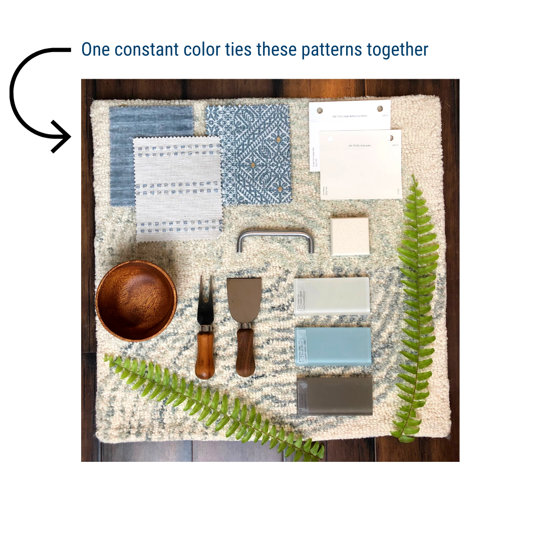
I want you to note the pattern selections at the top left. There are similarities, yes. But these patterns are inherently different. Like I mentioned earlier in this section, what ties them together is a constant color. It acts as an anchor, and that’s what makes this combination work.
Back to this lovely combo:
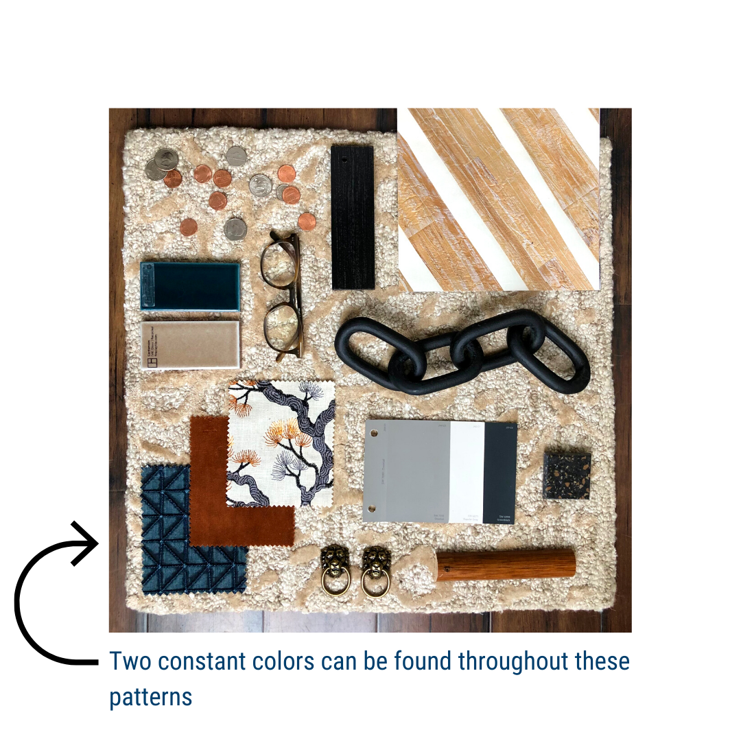
This is a great example of making bold choices. Once again, take note of the patterns selected in the bottom left corner. You wouldn’t think these would go together as each of them are so different. However, both the blue geometric and plain rust textiles inspire the third textile (the tree pattern). The blue hue from the tree’s trunk can be found in the geometric pattern, and the rust can be found in the leaves.
Now for a pop of color:
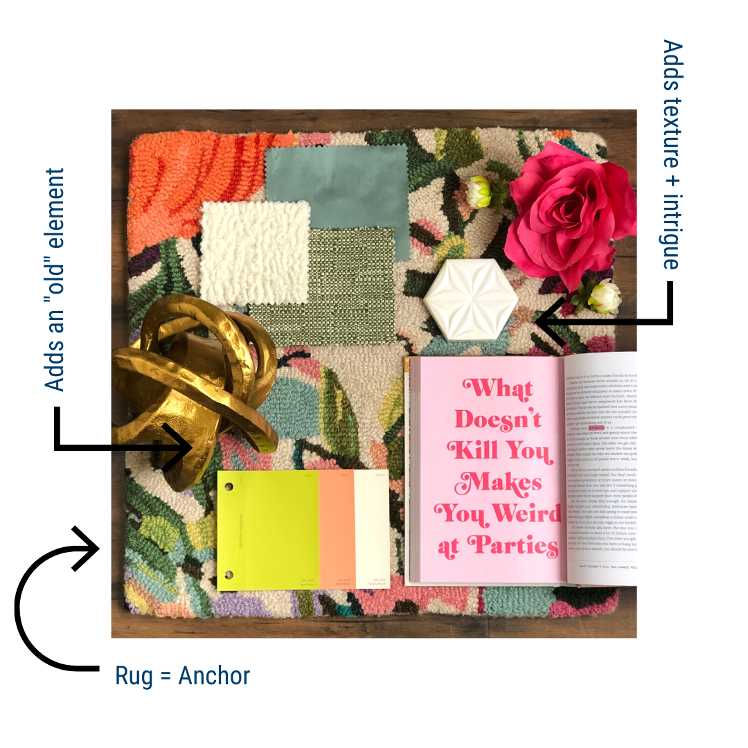
If you hadn’t already noticed, the rug acts as the anchor for this space. You can find the neon yellow, peach, white and eggshell blue colors from the paints and textiles in the rug itself. If you fall in love with an interesting rug, but you’re too afraid of how bold it is, use it as the anchor of your space!
Use that one piece you love and yearn for as inspiration for the rest of your space. I also want to note the use of textures in the white hexagonal tile and gold metal piece. This simply adds interest to your space. You could also argue that the metal piece acts as an “old” item to mix with all of the modern elements of this particular mood board.
Did someone say, “light and airy”?
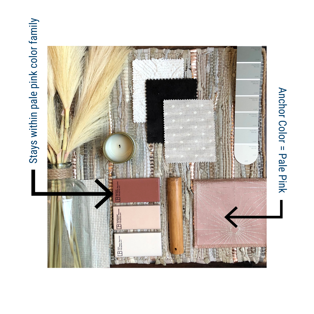
This mood board exudes serenity. But there’s also a little bit of drama when you bring in that black fabric. This is a great example of how you don’t need to do an exact match with your color palette all the way through.
Let’s say this homeowner chose a pale pink as their anchor color. They don’t have to stay within the bounds of pale pink to make the space appear cohesive. In fact, they can throw in that “Red Rock” colored tile and it will still work. That’s because they are more or less of the same hue as one another. We don’t need exact matches. We just want them to come from the same family.
Pro Tip:
Generally, everything in the room needs a “buddy.” For example, if you want to use a wood-toned vanity in a bathroom, be sure to incorporate this tone in at least one other piece in the room, like a small wooden stool in the shower, a wood-framed photograph, or a wooden toothbrush holder and cup. One singular color or tone in a space will stand out, but if each color or tone is peppered around the room in a coordinated way everyone will feel nice and cozy.
The Bottom Line
Here’s the basic bottom line:
Just have fun with it! You don’t need to get caught up in the details of color theory to know what will work and what won’t. Give your brain the credit it deserves; it can tell when a space is cohesive. Trust your gut on this process, and you can’t go wrong.
-
If you do discover that your space is not operating as cohesively as you’d like, start at the beginning. Use color as your anchor.
-
Mix “old” elements with “new” to create a space that is evergreen, or a space that won’t soon go out of style.
-
Mix until your heart’s content, but never forget to match some hues here and there.
This process is supposed to feel fun and liberating, so don’t stress too much about whether or not you’re doing it “right.” If it feels right to you, then it is right. It’s that simple.
If you’re still unsure of where to start on your next project, complete our quick Inquiry Form and we’ll be in touch!
