A Powder Room with Personality
August 24, 2020
If you’re anything like me, there are few things about each room of your home that you are not fond of. Maybe it has to do with the way the space looks, or maybe with the way it functions – or doesn’t function – for your and your family.
The key to designing a great room is to create solutions that not only solve the problem, but also add character to the space.
A few months ago a friend came to me with a dark Powder Room that needed updating. The room was fairly big for a first floor Powder Room, but it was not exactly a well designed space that she preferred to have guests and her family use on a daily basis.
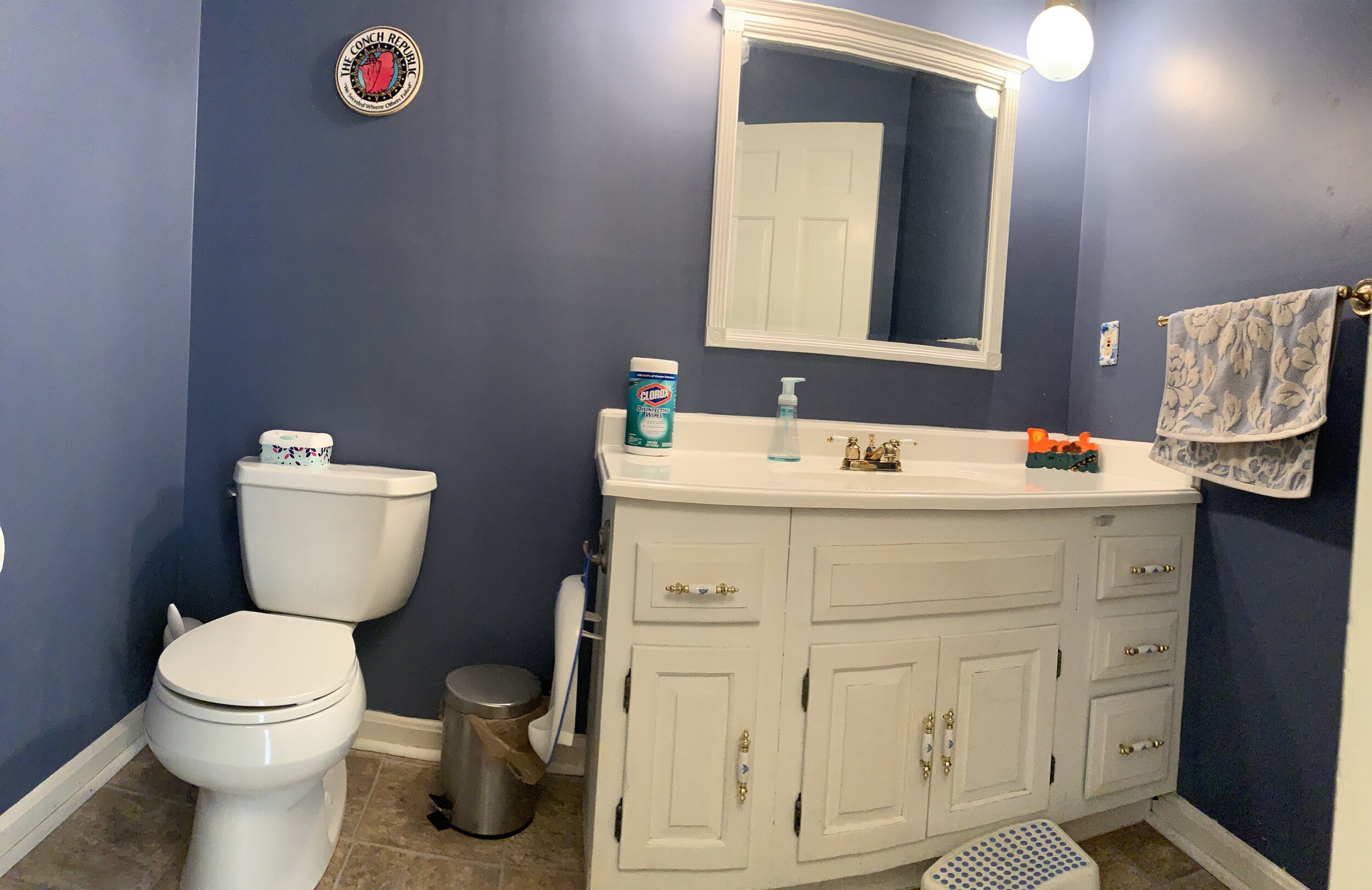
The Problem.
Her vision included keeping and painting the existing vanity but everything else needed to go. Choices for paint and tile were to be brighter than the current dark blue walls and brown floor. When we initially got together to discuss the challenges she was facing, I don’t remember the exact words she used so I’ll paraphrase: “boys pee everywhere”. This friend of mine is a mother of THREE boys. Real life problems include boys and bathrooms. I think any mom of a son will tell you there are easier tasks in life than keeping a clean bathroom while raising little boys.
The Solution.
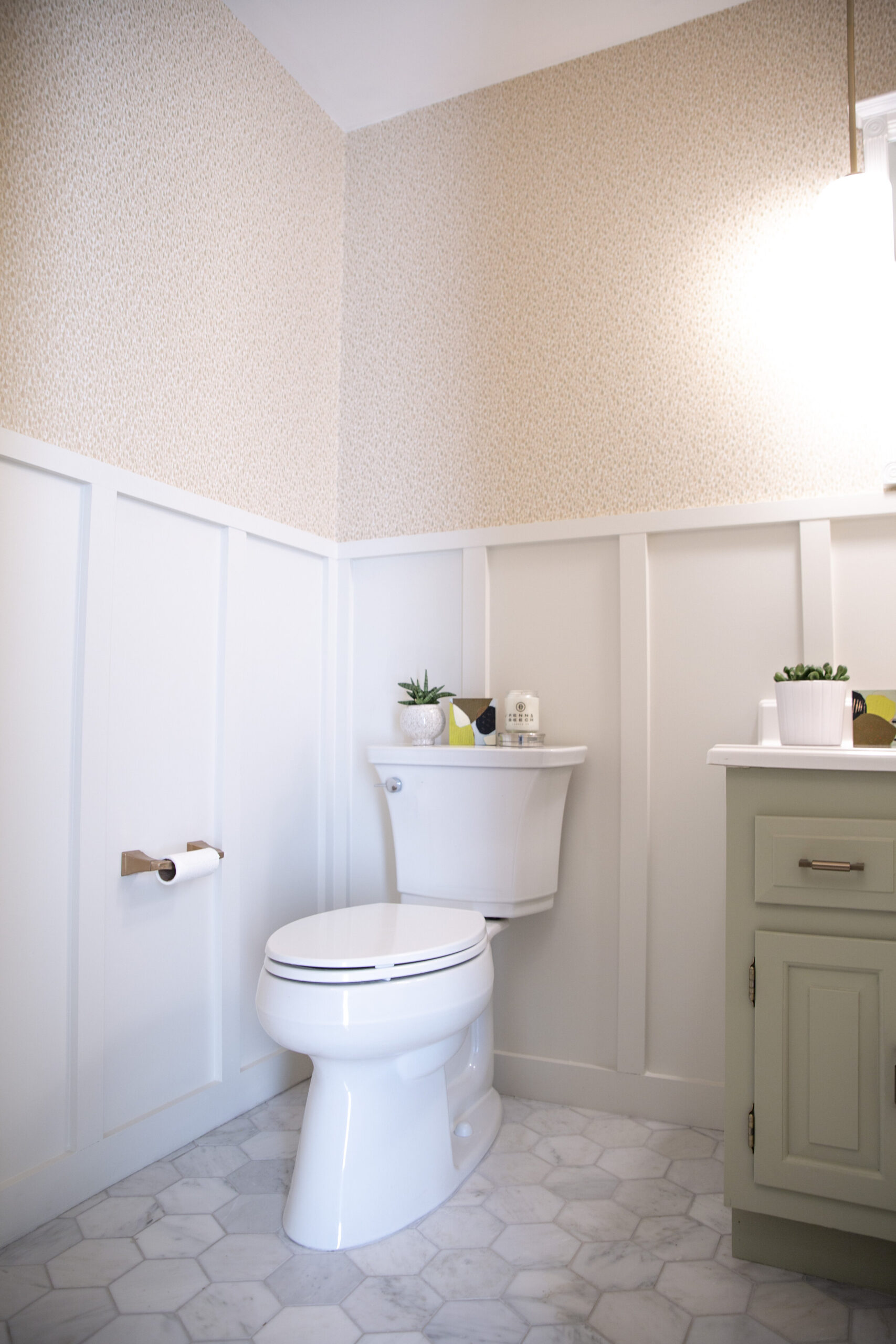
Originally we had wanted to wallpaper the space, including the area behind the toilet. We considered this for about half of a second before realizing that this wasn’t the best solution. So, I suggested we consider wall paneling. Not only will this protect the wall behind the commode, but it would also give the small space a custom look.
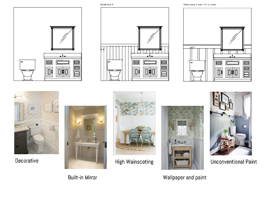
If you have ever considered installing wall paneling you understand that there are many looks that can be achieved by using different widths of wood and trim. Wainscoting, in particular, is a term used to describe any type of wall treatment that goes up only a portion of the wall.
Traditionally wainscoting is applied at heights of 72”, 54”, 42”, and 36” and is capped with a ledge. Below are a few diagrams and photos used during my Image Strategy presentation to describe the types of looks that can be achieved using wainscoting. We ultimately settled on the board and batten style, painted white.
Mood boards used to diagram the various types of wainscoting in combination with wallpaper.
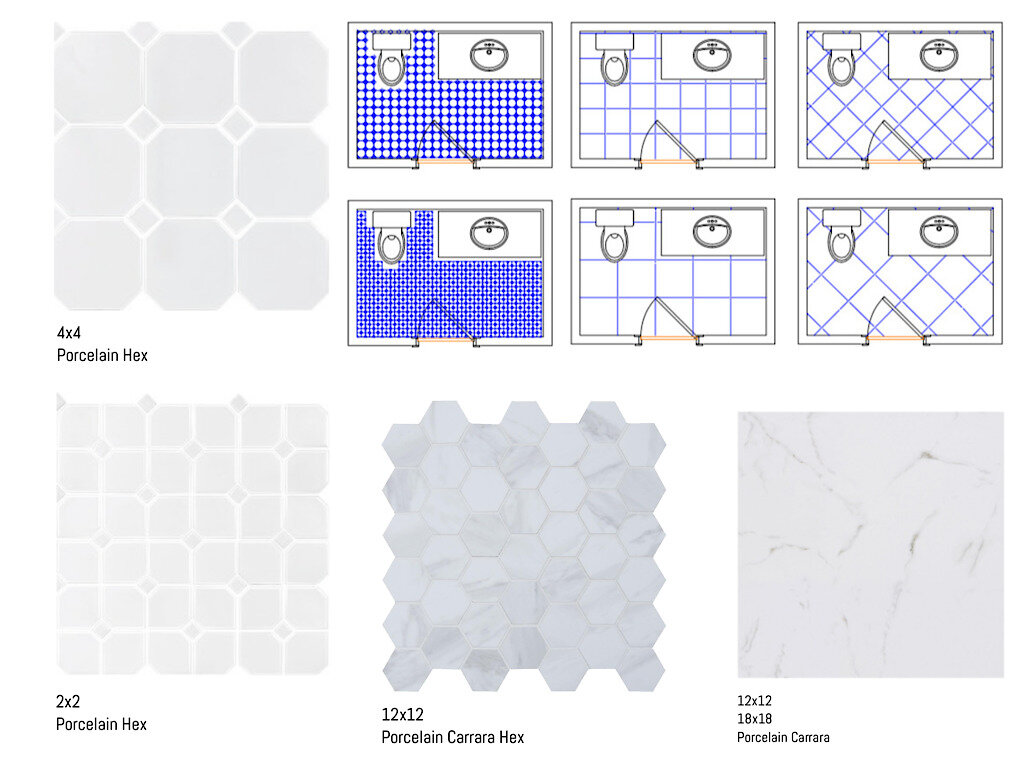
Mood boards used to diagram the various types of tile formats and grout lines.
In addition to paneling the walls, I also suggested that a porcelain tile with narrow grout lines for the floor to combat the aftermath of the lazy aimer. Porcelain tile comes in a vast array of patterns and colors and is very easy to maintain. Below is an image used to show how different the floor would have looked having chosen one tile format over the other. The best solution for her was a larger format tile with personality, thus the large hex.
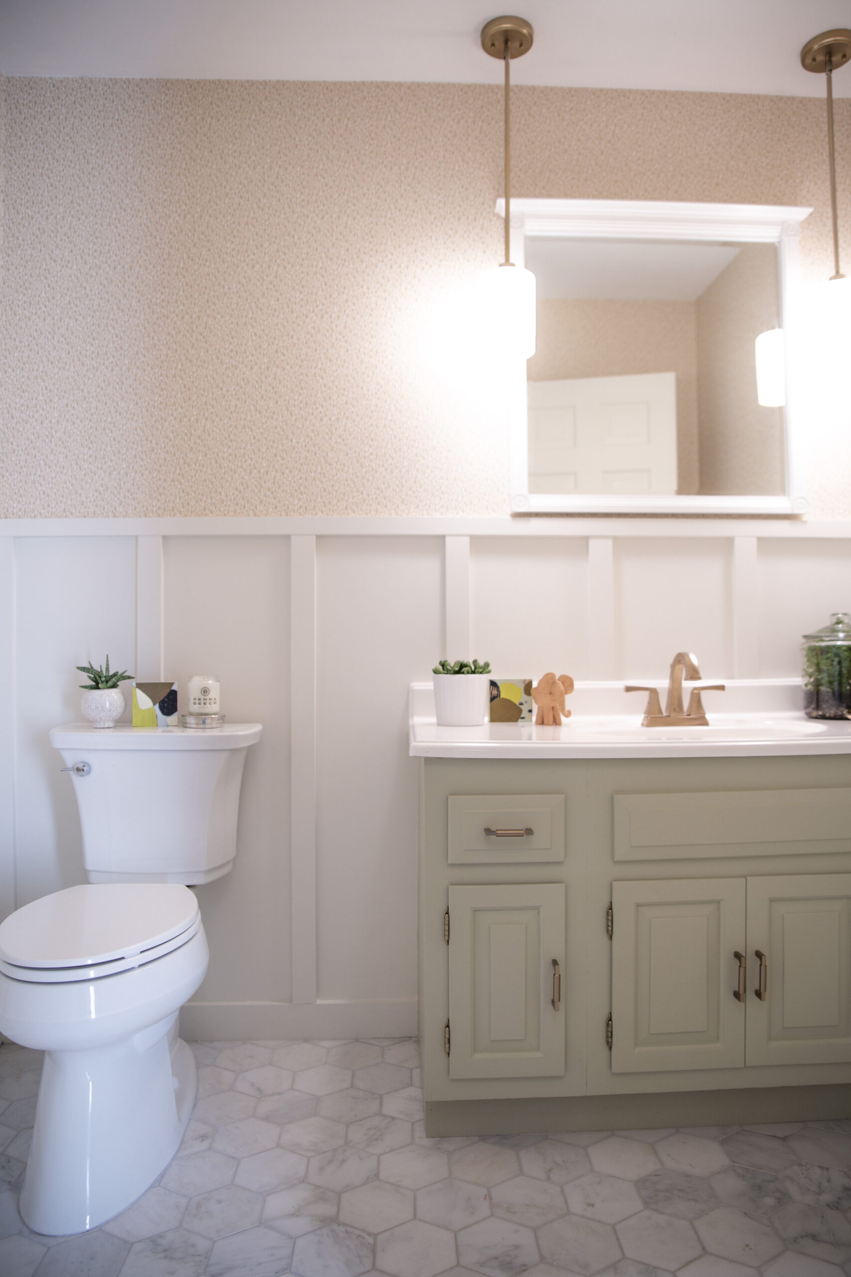
Once we settled on the overall color scheme and the wallpaper, the room came together quite seamlessly.
Final Design Diagram
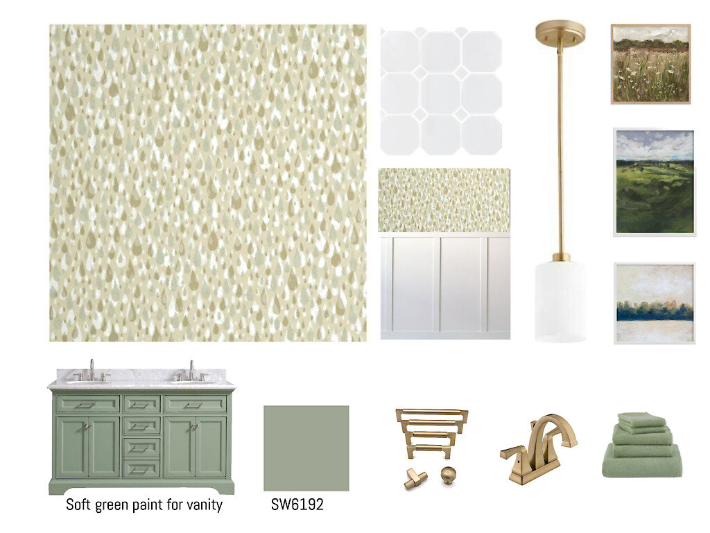
There are many details in this small Powder Room that all work together so beautifully, they deserve their own shout out.
-
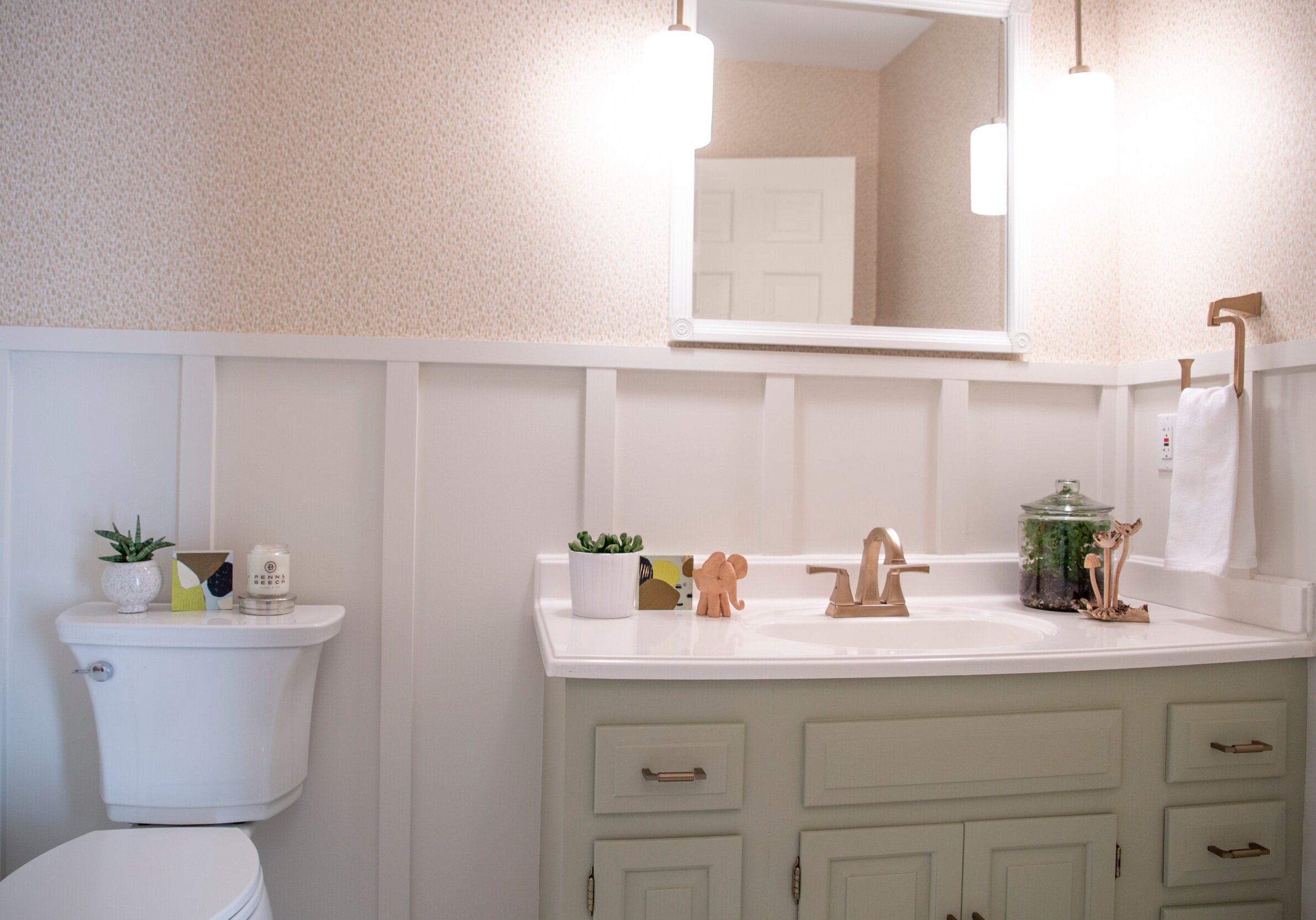
I adore how the scale of the hex tile works with the wainscoting, not to mention the charming rain drop wallpaper.
-
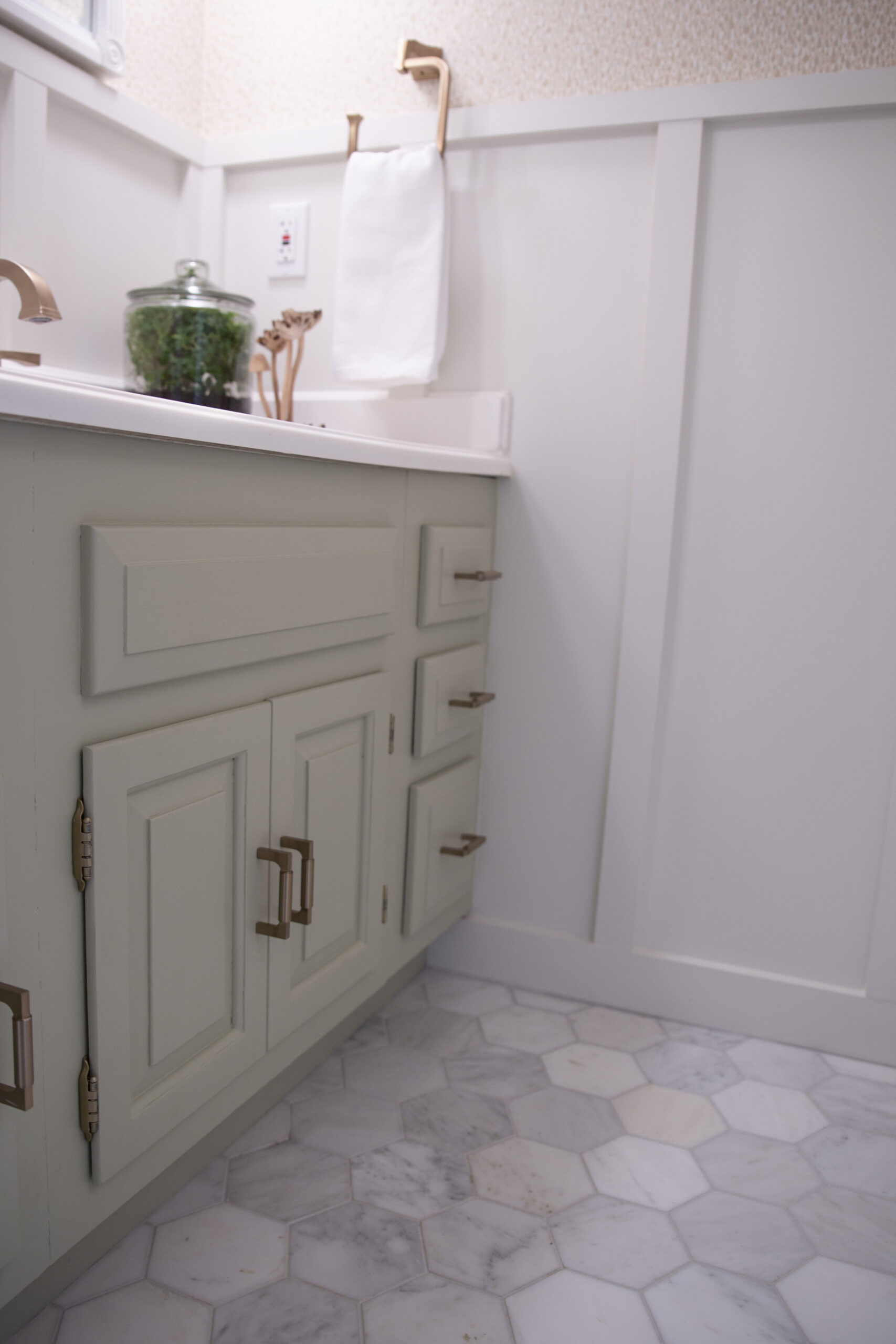
The soft green vanity is really the only muted pop of color in the space which helps it stand out in the most passive way.
-
The updated pendant lighting provides ample light in this now very bright room.
-
The aged brass tones in the hardware and faucet balance out the silvery shimmer in the wallpaper.
Design should not only provide solutions to your problems but add character, too.
We would love to help you with creative solutions to your design problems!
